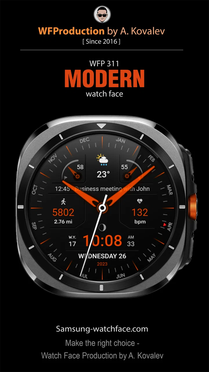
WFP 311 Modern watch face
- 4.3
- Rating
- 10.00K
- Installs
- $1.99
- Price
 Analysis by App-foxy
I approached WFP 311 as a small personalization purchase rather than a major app installation. It is a watch face for Wear OS devices, created by WFProduction by Alexandr Kovalev, and its appeal depends almost entirely on whether its visual style fits the way you use your smartwatch. After spending time with it, my impression is that it aims for a clean, modern presentation instead of trying to turn the watch into a miniature phone.
That distinction matters. A watch face is something you look at dozens of times without thinking, so a design that feels attractive for five minutes can become tiring after a day. WFP 311 works best for someone who wants the wrist to look deliberately styled and easy to read, not for someone searching for a huge information dashboard or a playful animated theme. I would describe it as a focused choice in the personalization category: its value comes from the character of the face itself, not from a long list of unrelated tools.
How WFP 311 feels in everyday use
The first thing I noticed is how different a watch face feels from a normal Android or iOS app. There is no long session to settle into. The product has to succeed in a glance, when I am checking the time while walking, working, cooking, or waiting for transport. WFP 311 is therefore judged by visual balance, legibility, and how naturally it sits on the watch rather than by the kind of feature count I would expect from a productivity app.
You May Also Like

 Pandora - Music & Podcasts
Pandora’s Music Is Easy to Start, but Harder to Recover
Pandora’s strength is its low-effort path from a seed to a station. Its weak spot is how much confidence it asks you to place in connection, setup, and quiet recovery.

 8 Ball Pool
 Is Built on Rivalries, Rematches, and Routine
A close look at the rivalries, rematches, shared routines, and unanswered safety questions that turn a quick pool match into a persistent mobile community.

 Samsung Music
’s Quiet Strength Is Playing What You Already Own
Its reach comes less from spectacle than from dependable access to a personal library. That simplicity is both the app’s strongest retention engine and its ceiling.

 AccuWeather: Weather Radar
AccuWeather Review: A Quick, Clear Forecast for Everyday Decisions
For everyday plans, the best forecast is the one you can understand quickly. AccuWeather makes rain timing, radar, and local conditions easy to act on, with a few trade-offs.

 Hill Climb Racing
Why Hill Climb Racing Still Turns Crashes Into One More Run
A tiny car, a bumpy hill and one more upgrade: Hill Climb Racing keeps resurfacing because its simple chaos makes every near-miss feel personal.

 AliExpress - Shopping App
AliExpress Makes Global Shopping Feel Personal, but Shoppers Bear the Risk
AliExpress turns a global marketplace into a pocket-sized discovery engine. Its reach is useful, its shopping loop compelling, and its trade-offs easy to miss.
More From Our News Desk
View All News


In a typical morning, I might check the time while getting ready, glance again during a meeting, and look once more when deciding whether I have enough time to leave home. A modern face can make those moments feel less cluttered than a crowded layout. I found the strongest use case to be a user who wants a consistent visual identity on the wrist and prefers a designed appearance over the default face bundled with the watch.
It also makes sense for people who change the look of their phone, watch strap, or home screen to match their personal taste. The watch face is visible often enough to become part of clothing and accessory choices. That is a more convincing reason to choose this app than simply wanting “something new.” If you already like the appearance of your watch and only want a more considered front screen, this is the kind of focused purchase that can make the device feel refreshed without replacing it.
At the same time, I would not recommend buying it blindly just because the word “modern” sounds appealing. Modern design can mean restrained and readable to one person, while another person may find it too plain or insufficiently informative. Before choosing it, I would compare the store images with the size and shape of the Wear OS watch you actually wear. A face that looks balanced on a round display may not create the same impression on a different case or screen proportion.
A focused design instead of an information wall
My main trade-off is straightforward: WFP 311 appears designed to give the watch a distinct appearance, while many free alternatives compete by displaying as much information as possible. Those alternatives may be better if your first priority is seeing several health, weather, calendar, or device details immediately. A dense face can reduce the need to open other screens, but it can also make the central time display less comfortable to read.
I prefer a face that makes me understand the time instantly. That does not mean a minimal layout is automatically superior. If you rely on your watch for frequent information checks, you should decide whether the visual styling leaves enough room for the details you personally need. The practical test is not whether the face looks impressive in a screenshot; it is whether you can read it at a quick angle, in ordinary lighting, without pausing to interpret it.
One useful habit is to judge it at three moments: first thing in the morning, outdoors while moving, and late in the day when your attention is low. A design that feels elegant at a desk may become less convenient when the watch is tilted or partially covered by a sleeve. This is the kind of real-world check that store previews cannot replace, and it is especially important with a paid watch face.
What the release history tells me
The app was released on April 13, 2023, so it is not a brand-new experiment appearing without any history. Its presence in the catalog gives it a period of use behind it, while the current product should still be judged by how well it fits present-day Wear OS habits. I see that as a modest positive: the face has had time to establish its identity, but age also makes it sensible to check compatibility and current appearance before purchasing.
The developer is listed as WFProduction by Alexandr Kovalev. That makes the product feel like a specialized design from an identifiable creator rather than a broad platform with a large collection of unrelated services. For a watch face, that focused authorship can be valuable because the visual decisions are likely to follow one coherent idea. It also means the experience is centered on this particular design, so people looking for a large ecosystem of interchangeable faces may prefer a different publisher.
The current store position is fairly encouraging without making the app look universally dominant. It holds a 4.3 average from around 1.7 thousand ratings, with more than 90 written reviews and over 10 thousand installs. I read those figures as evidence of a real audience and a generally positive response, not as a guarantee that every display, preference, or Wear OS setup will feel identical. A watch face is unusually personal: readability, wrist position, screen size, and taste can change the verdict completely.
The price is $1.99, which puts it in the category of an inexpensive paid customization rather than an open-ended subscription. I like that model for a design item because I can decide whether the look is worth a small one-time purchase instead of evaluating another recurring charge. Still, the amount is not meaningless if you change faces frequently. Someone who experiments constantly with free options may get more enjoyment from browsing alternatives than from committing to one polished design.
What existing users should expect
If you already use WFP 311, the most important point is that its identity is stable and easy to understand: it is a dedicated Wear OS watch face, not a companion service that tries to expand into phone customization or general device management. The release date and current catalog presence suggest a product with an established place rather than a launch-day preview. I would approach updates as opportunities to preserve compatibility and refine the experience, not as a promise of a completely different watch face.
That matters when deciding whether to replace it. If the current appearance already gives you the balance you want, changing away from it may only create work without solving a real problem. On the other hand, if you have started wanting more practical information on the main screen, the limitation is conceptual rather than cosmetic. A newer-looking version of the same design would not automatically turn it into a data-heavy face, and another app may be the better answer.
I also recommend keeping your expectations realistic about switching between faces. The value here is cumulative: seeing a design you like every day can justify a small purchase, but the benefit is not measured in a dramatic new function. If you tend to install a face, admire it briefly, and move on, WFP 311 may feel less rewarding than it does to someone who wants a dependable long-term choice.
A practical workflow is to use it during a normal day before making a final judgment. Wear it through a busy period, check it while your hands are occupied, and notice whether you instinctively understand the display. If you keep opening the watch’s other screens to find information you expected to see immediately, that is a sign that the face may not match your routine. If you stop thinking about the layout and simply read the time, that is usually a good sign.
Where the experience still has limits
The largest limitation is the narrow purpose. WFP 311 is not the right choice for someone who wants a watch face to replace several separate checks throughout the day. Users who organize their schedule from the wrist, monitor multiple metrics, or depend on a very specific arrangement of information should examine feature-rich alternatives first. In that situation, visual polish is secondary to information density and customization depth.
Another possible friction point is the paid format. At $1.99, the purchase is relatively easy to justify when the face becomes part of your daily routine, but it is harder to justify if you are only curious. Free faces let you test a style with no financial commitment, while paid designs ask you to decide earlier. I would personally buy this one only after confirming that its look suits my watch and that its information balance matches my habits.
Compatibility is also worth treating as a practical question rather than an assumption. The app is intended for Wear OS devices, but Wear OS watches are not visually identical. Screen dimensions, display behavior, and the way each device presents a face can affect comfort. I would check the device support shown in the current store page before paying, then install it when the watch is charged and connected. That avoids making a rushed decision during a busy day and gives you time to assess the result properly.
There is also a personal limitation that no rating can solve: a modern face can age differently for different users. Some people enjoy a consistent, understated look for months. Others need regular novelty and will find any single design repetitive. If you know that you change watch faces every few days, the purchase may not be the best use of your money, even if the design itself is attractive.
Who should choose it, and who should pass
I would recommend WFP 311 to a Wear OS owner who wants a purposeful visual refresh, values a clean glance at the time, and is comfortable paying a small amount for a dedicated design. It is especially suitable for someone who sees the watch as part of an outfit or daily style rather than only as a technical instrument. The established rating and install history add reassurance that other users have found enough value to keep it in circulation.
I would steer away from it if your decision depends on extensive customization, a large number of visible data points, or a free trial mindset. In those cases, a more configurable face or a free catalog may serve you better. I would also skip it if the preview does not immediately appeal to you. Watch faces are not like background utilities that can remain invisible; you will look at the design repeatedly, so a small visual irritation becomes surprisingly noticeable.
For an existing user considering a change, the key question is not whether another face has more options. It is whether those options solve a problem you actually have. If your current face feels crowded or visually dated, WFP 311 may be a welcome reset. If your current face already provides the information you need and you are happy with its appearance, the switch is more about taste than improvement.
What I would watch in its future
Because this is a focused personalization product, I would pay attention to three things as it continues to live in the Wear OS ecosystem. First is continued compatibility with newer watch software and devices. A watch face can remain attractive while becoming less useful if installation or display behavior becomes unreliable. Second is whether the developer preserves the visual clarity that makes a focused design worthwhile. Adding more elements is not automatically progress if it makes quick reading harder.
Third is how well the product keeps its value beside free alternatives. The one-time price is reasonable for a face that becomes a regular part of your routine, but that value depends on dependable presentation and a design that does not feel disposable. I would rather see careful refinement than a rush toward excessive features. For this kind of app, restraint is an advantage only when it remains practical.
My final view is positive but specific. WFP 311 is best understood as a style-led Wear OS purchase, not an all-purpose smartwatch upgrade. I like its clear purpose, identifiable developer, and low one-time cost, and the existing user response suggests it has found a real audience. Its weaknesses are the same boundaries that define it: people who need a dense, highly configurable information center should look elsewhere.
If the current design matches your taste and you want your watch to feel more personal every time you raise your wrist, I think it is a sensible choice. Before installing, compare the face with your actual display, consider how much information you need at a glance, and give it a full ordinary day rather than judging it only from a preview. For the right user, that small amount of care is enough to turn a simple watch-face purchase into a satisfying everyday upgrade.
FAQs for WFP 311 Modern watch face
01What is WFP 311 Modern watch face?
WFP 311 Modern is a customizable digital watch face designed for compatible Wear OS smartwatches. It focuses on a clean, modern layout with time, date, battery information, and additional indicators that can be adjusted according to your preferences. Before downloading, check that your watch uses Wear OS and that the required version and installation method are supported by the developer.
02Which smartwatches are compatible with WFP 311 Modern?
Compatibility depends on the Wear OS version and the watch model supported by the developer. It is generally intended for Wear OS devices rather than older watches running proprietary systems, Fitbit OS, or Apple watchOS. Before installing, review the Google Play listing for the current compatibility information, because some features, complications, or installation options may vary between Samsung Galaxy Watch, Google Pixel Watch, Fossil, Mobvoi, and other Wear OS models.
03Can I customize the appearance and information shown on the watch face?
WFP 311 Modern is designed to offer personalization, although the exact options depend on the version installed and the capabilities of your smartwatch. Users may be able to change colors, complications, display elements, or other visual settings through the watch face customization menu. It is worth checking the available screenshots and description before downloading if you need specific data such as steps, weather, heart rate, or calendar information.
04Does WFP 311 Modern affect battery life or require special permissions?
Like any active watch face, WFP 311 Modern can have a small effect on battery consumption, especially when using animated elements, frequent updates, sensors, weather data, or several complications. Battery performance will vary by watch and configuration. The app may also request permissions for optional information such as health data, location, notifications, or complications, so review each permission carefully and allow only the features you intend to use.
05How do I install WFP 311 Modern and what should I do if it does not appear?
Installation is normally completed through the Google Play Store on your phone or Wear OS watch, followed by selecting WFP 311 Modern from the watch face picker. In some cases, the face may take a moment to synchronize or may need to be installed directly from the watch. If it does not appear, verify the connected Google account, restart the watch and phone, check compatibility, and consult the developer’s installation instructions before requesting support.
Pros
- Clean modern design suits both casual and professional outfits.
- Readable layout makes key information easy to check at a glance.
- Offers useful customization for colors and displayed complications.
- Designed for Wear OS with a polished
- watch-focused interface.
- Low visual clutter keeps the time and essential data prominent.
Cons
- Some features may require a compatible Wear OS smartwatch.
- Battery impact can vary depending on brightness and update frequency.
- Small screen sizes may make detailed complications harder to read.
- Customization options may feel limited compared with premium watch faces.
- Availability and functionality can differ between watch models.

WFP 311 Modern watch face
Gallery